They wanted a name that said skin and anti-aging. I combined the word “skin” with the word “age” in reverse, and out came skin + ega = SKINEGA. The name origin isn’t necessarily obvious when it’s read, it’s still a nice, short name that works well. I felt the name was strong enough to stand alone without a logo and so the name itself became the logo.
Packaging Design
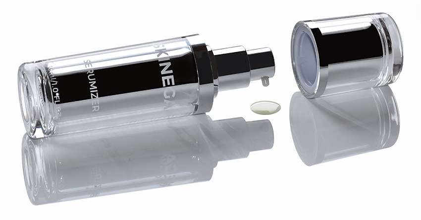
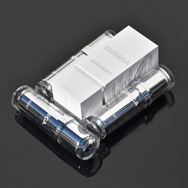
The remit for the packaging was simplicity and luxury with a gender-neutral feel. I designed a textured hard box exterior packaging to help deliver this message with a sleek, clean, silver bottle. The result was a beautifully photogenic finish, which was important for this direct-to-consumer brand.
E-Commerce
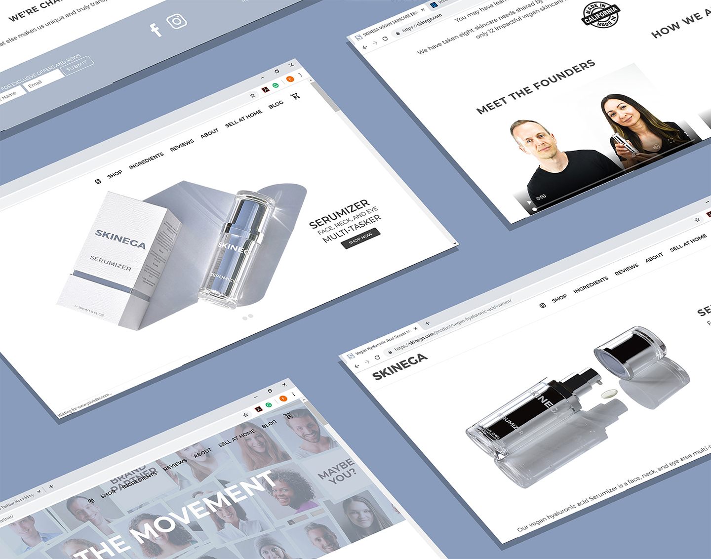
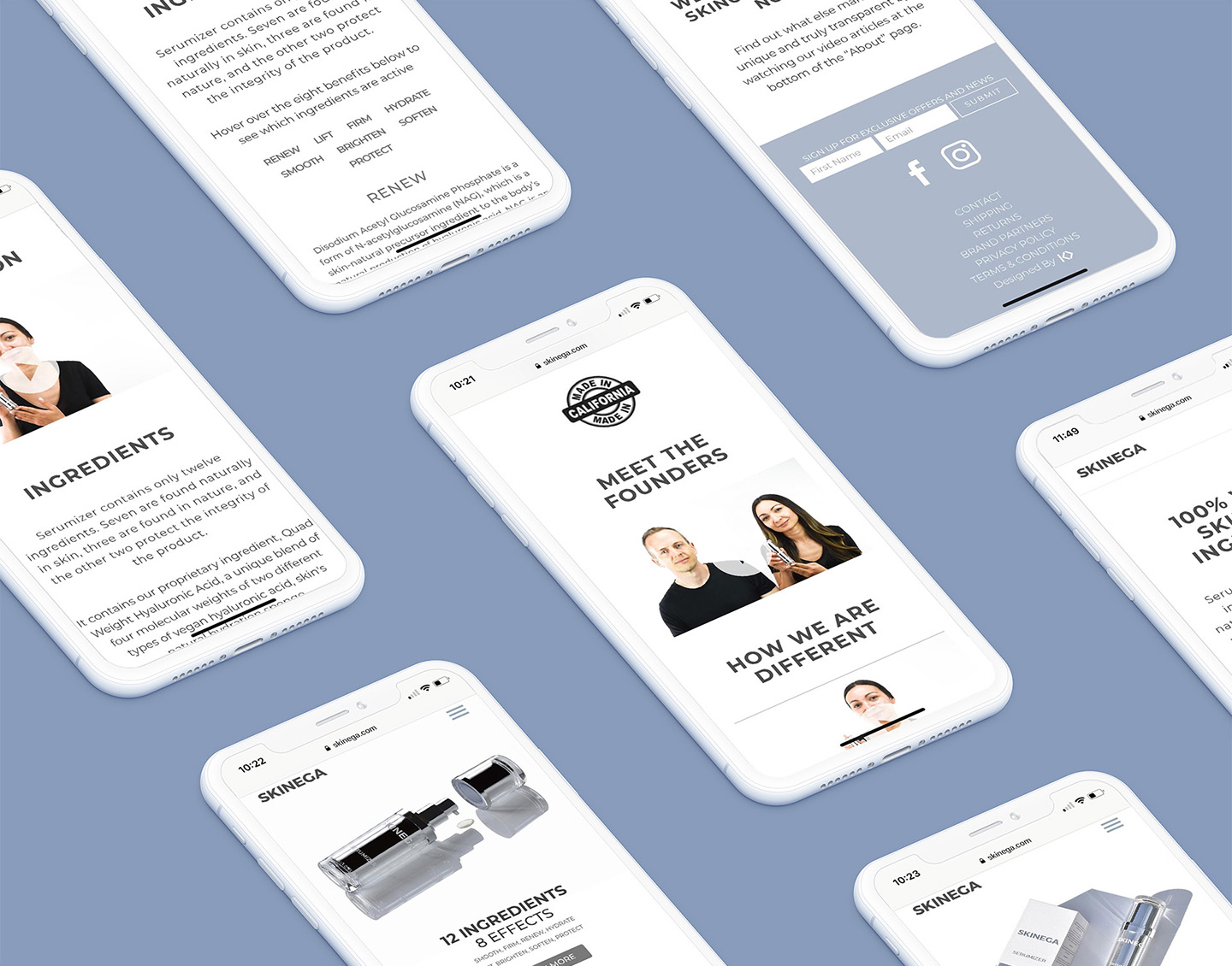
I built a fully responsive, highly intuitive e-commerce website with a simple and sleek design to help navigate customers to purchase through this direct to consumer site.We also wrote scripts and shot videos for the founders to showcase the product, and why it is unique.